How Sketchnoting Boosts Retention: A Step-by-Step Guide to Visual Learning
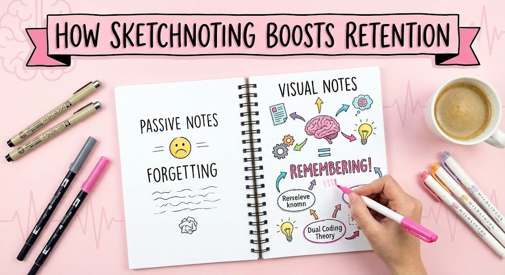
There is a silent epidemic in lecture halls around the world. It is called "Passive Transcription."
It happens when a student sits in a class, pen in hand, and tries to write down every single word the professor says. The student isn't thinking. They aren't analyzing. They are acting like a human printer. By the end of the hour, they have five pages of messy text, a cramping hand, and absolutely zero retention of what they just learned.
If this sounds like you, I have good news: There is a better way. It's called Sketchnoting.
Before you panic and close this tab, let me clarify one thing: Sketchnoting is not drawing. It is not art. It is a thinking tool. You do not need to be an artist to do it. If you can draw a stick figure and a box, you are already over-qualified.
In this comprehensive guide, we will dive deep into the science of why visual notes work, the "Visual Alphabet" you need to master, and 5 specific layouts that will transform your boring text blocks into vibrant, memorable knowledge maps.
Part 1: The Science Behind Visual Notes

What Is Sketchnoting?
Sketchnoting is a visual note-taking method that combines keywords, simple drawings, symbols, and structured layouts to capture ideas. Unlike traditional note-taking, which focuses on recording information word-for-word, sketchnoting emphasizes understanding, synthesis, and memory.
Why should you spend time doodling when you could be writing words? Is it just to make your notes look "aesthetic" for social media? Absolutely not. The benefits are grounded in cognitive psychology.
Visual note-taking techniques similar to sketchnoting are widely referenced in educational research, learning design communities, and professional training environments. Methods that combine visuals with structured text are commonly associated with active learning strategies and cognitive load reduction.
1. Dual Coding Theory
In 1971, psychologist Allan Paivio proposed the Dual Coding Theory. He discovered that the human brain has two distinct channels for processing information:
- The Verbal Channel: Processes text and audio (words).
- The Visual Channel: Processes images and spatial relationships (pictures).
When you take traditional notes, you are only using the Verbal channel. You are overloading it. But when you Sketchnote, you use both channels simultaneously. You hear the concept "Economy" (Verbal) and you draw a "Dollar Sign" (Visual). This creates two separate mental "hooks" for the same information, effectively doubling your retention capacity.
2. The Picture Superiority Effect
Studies consistently show that images are more memorable than words. This is known as the Picture Superiority Effect. If I tell you a list of 10 items, you might remember 3. If I show you pictures of those 10 items, you will likely remember 7 or 8. By translating an abstract concept (like "Freedom") into a concrete visual (like a "Bird"), you make the idea "sticky."
📊 Data Comparison: Linear vs. Visual Notes
The figures below represent approximate ranges commonly reported in learning research and student self-assessments, rather than exact measurements.
| Metric | Traditional (Linear) Notes | Sketchnoting (Visual) |
|---|---|---|
| Focus Level | Low (Passive listening) | High (Active synthesis) |
| Information Density | High (Too many words) | Optimal (Curated keywords) |
| Review Time | Slow (Re-reading text) | Fast (Scanning images) |
| Exam Recall | ~10-20% after 1 week | ~65-80% after 1 week |
Part 2: The Visual Alphabet (Yes, You Can Draw)

The biggest barrier to entry is the fear of drawing. "I can't draw a horse!" you might say. Good news: You don't need to draw a horse. You need to draw a "representation" of a horse.
Visual thinker Dave Gray teaches that all drawings can be broken down into 5 Basic Elements. We call this the Visual Alphabet:
Once you master these 5 shapes, you can combine them to build a "Visual Library." Here are the essential icons every student needs to know how to draw:
Build Your Vocabulary: 5 Essential Icons
- Idea / Insight: Draw a simplified Lightbulb (Circle + Square base + Lines for light). Use this when the professor explains a core concept.
- Process / Flow: Draw an Arrow. A thick arrow means a big trend; a thin arrow means a sequence.
- Conflict / Debate: Draw two Lightning Bolts crashing into each other. Use this for history battles or literary conflicts.
- Data / Fact: Draw a Bar Graph (L-shape line + 3 rectangles). Use this for statistics.
- Important / Warning: Draw an Exclamation Mark inside a Triangle. Use this for "This will be on the test."
📚 The 30-Second Icon Library (Cheat Sheet)
Stuck on what to draw? Here is a quick reference guide for common academic concepts. Feel free to screenshot this!
| Concept | Visual Metaphor | How to Draw It |
|---|---|---|
| Energy / Power | ⚡ Lightning Bolt | Simple zigzag line |
| Global / World | 🌐 Globe | Circle + a cross inside (representing latitude/longitude) |
| Science / Test | 🧪 Flask | Triangle with a long neck + bubbles on top |
| Growth / Change | 🌱 Seedling | Curved line + two oval leaves at the top |
| Search / Inquiry | 🔍 Magnifying Glass | Circle + a line sticking out (handle) |
| Team / People | 👥 Figures | Simple "M" shape for shoulders + dots for heads |
Part 3: The 5 Holy Layouts

Most sketchnoting failures are not caused by poor drawing skills, but by lack of structure. Without a clear layout, even good ideas become visual clutter. Choosing the right layout before you start writing dramatically reduces cognitive load.
The hardest part of Sketchnoting is not the drawing; it is the Structure. Where do you put the information on the page? You don't want a messy jumble. Here are 5 proven layouts used by professionals.
Imagine a river winding down your page in an "S" shape. You start at the top left, follow the path to the right, curve down, go left, and so on.
Best For: Chronological events, History timelines, Biographies, Processes (Step 1 to Step 10).
Draw the main topic in a big circle in the absolute center of the page. Then, draw branches radiating outwards for each sub-topic.
Best For: Philosophy, Science concepts, Systems where everything connects to a central core (e.g., "The Solar System").
Draw a line down the middle of the page (or 1/3 to the left). Use the left column for "Headlines/Icons" and the right column for "Details/Text."
Best For: Structured lectures, Comparison lists (Pros vs Cons), textbook summaries.
Divide your page into 4 or 6 distinct boxes before the lecture starts. Fill one box at a time.
Best For: Conferences with multiple speakers, or lectures that cover distinct, unrelated topics.
Just put ideas on the page wherever there is space, like popcorn popping in a pan. Draw a box around each idea to separate them.
Best For: Fast speakers, rambling professors, Q&A sessions where you cannot predict the structure.
Part 4: The Essential Toolkit

You cannot Sketchnote effectively with a ballpoint pen that smears. You need specific tools to build your layers.
1. The Skeleton: Waterproof Fineliner
You need a black pen that is permanent and waterproof. Why? Because you will be highlighting over it later. If you use a standard water-based gel pen, the ink will smear and ruin your drawing.
Recommendation: Sakura Pigma Micron (05 size) or Uni Pin. These use archival pigment ink.
2. The Shadow: Grey Brush Pen
This is the "Secret Weapon." A simple black doodle looks flat. But if you take a light grey brush pen and add a line of grey to the right and bottom of your box, it instantly looks 3D. It makes the note "pop" off the page.
Recommendation: Tombow Dual Brush Pen (N75 or N95).
3. The Accent: Mild Highlighter
Pick ONE accent color. Just one. Use this to color in your arrows, headers, and key containers. Using too many colors creates "Visual Noise" and increases cognitive load.
Recommendation: Zebra Mildliner (Gold, Cyan, or Smoke Blue).
The goal of this toolkit is not variety, but reliability. Each tool has a clear role: structure, depth, and emphasis. More tools do not create better notes — better decisions do.
📱 The Hybrid Sketchnoter: Paper vs. iPad (2026 Edition)
In 2026, many students are switching to digital notes on iPad (Goodnotes/Notability). While Auntie Mei loves the tactile feel of paper, digital tools are valid—if you use them correctly.
Auntie Mei's Verdict: Use what removes friction. However, if you use an iPad, you MUST turn off "Shape Auto-Correction" (that feature that turns your wobbly circles into perfect circles).
Why? The imperfections in your hand-drawn lines act as "cognitive texture." They help your brain remember the specific moment you drew them. Perfect vector shapes look generic and are harder to recall later. Keep it messy to keep it memorable!
Part 5: Why Sketchnoting Doesn't Work for Everyone
- Focusing on decoration instead of meaning
- Using too many colors and tools
- Attempting sketchnoting for the first time in high-pressure lectures
- Trying to copy examples instead of developing a personal visual language
Part 6: The 3-Phase Workflow

Sketchnoting is not just about what happens during the lecture. It is a process.
-
Phase 1: Pre-Lecture (The Setup)
Arrive 5 minutes early. Write the Title and Date in big, bold letters at the top. Draw your layout borders (if using Modular or Split). This eliminates "Blank Page Fear." -
Phase 2: During Lecture (The Capture)
Do not try to make it perfect. Use black ink only. Focus on Listening > Synthesizing > Drawing. If you miss a detail, leave a blank space and move on. Do not color during the lecture; it's too slow. -
Phase 3: Post-Lecture (The Polish)
This is where the magic happens. Go to a coffee shop or library immediately after class. Take out your Grey pen and Highlighter. Add shadows. Add color. Fix spelling. This "Second Pass" serves as your first review session, solidifying the memory.
To maximize long-term memory, combine Phase 2 and 3 into a strict protocol based on Spaced Repetition.
Phase A (In Class): Use a pencil or black pen only. Scribble fast. Focus on capturing the structure. It will look ugly. That is okay.
Phase B (24 Hours Later): Do not just color it in. Test yourself. Look at your black-and-white sketch. Can you explain the concept out loud just by looking at the icon? Once you successfully explain it, then you earn the right to color it in. This turns "coloring" into an active recall test.
🏆 The 7-Day Sketchnote Challenge
Don't just read this article. Build the muscle. Commit to one small task per day.
- Day 1 Draw 50 circles. Turn them into 50 different objects (pizza, clock, face, earth...).
- Day 2 Practice drawing 10 different styles of Arrows (thick, thin, 3D, dashed).
- Day 3 Create your own "Avatar" (a simple stick figure of yourself) to use in notes.
- Day 4 Listen to a 5-minute podcast and sketchnote it using the "Popcorn" layout.
- Day 5 Practice drawing 5 fonts (Bold, Script, Serif, Block, Bubble).
- Day 6 Create a visual "To-Do List" for your weekend using icons only (no words!).
- Day 7 The Final Boss: Sketchnote a full TED Talk (approx. 15 mins).
Part 7: Frequently Asked Questions (FAQ)
Yes. As mentioned in Part 2, sketchnoting relies on "Glyphs" (symbols), not art. You are communicating, not decorating. If you can write the alphabet, you have enough motor control to sketchnote.
Initially, you might feel slower. But this forces you to stop transcribing (mindless) and start synthesizing (mindful). You might write down fewer words, but you will capture more meaning. The goal is "Quality over Quantity."
Absolutely. Science is naturally visual (diagrams, cells, chemical bonds). For Math, you can use visual containers to box formulas and arrows to show the flow of logic step-by-step.
For beginners, Paper is better. Digital tools offer too many options (undo, zoom, 500 colors), which can be distracting. A pen and paper force you to be decisive and move forward. Master paper first to build the cognitive muscle.
Embrace it. There is no Command-Z in analog life. If you draw a line wrong, turn it into a box. Or just cross it out with a bold "X" – that in itself is a visual signal that "This is wrong."
Limit yourself to 2 colors + Black. Using too many colors causes decision fatigue and makes the page look chaotic. One color for "Structure" and one color for "Emphasis" is enough.
Yes. Research on visual learning and dual coding suggests that combining words with images improves comprehension and long-term recall. Many students find that sketchnotes reduce review time and increase understanding compared to text-only notes.
Don't start with a live, high-stakes lecture. Start with a TED Talk or a YouTube video. You can pause the video if you get overwhelmed. This is the "training wheels" phase of Sketchnoting.