From Chicken Scratch to Calligraphy: The Ultimate Guide to Fixing Adult Handwriting
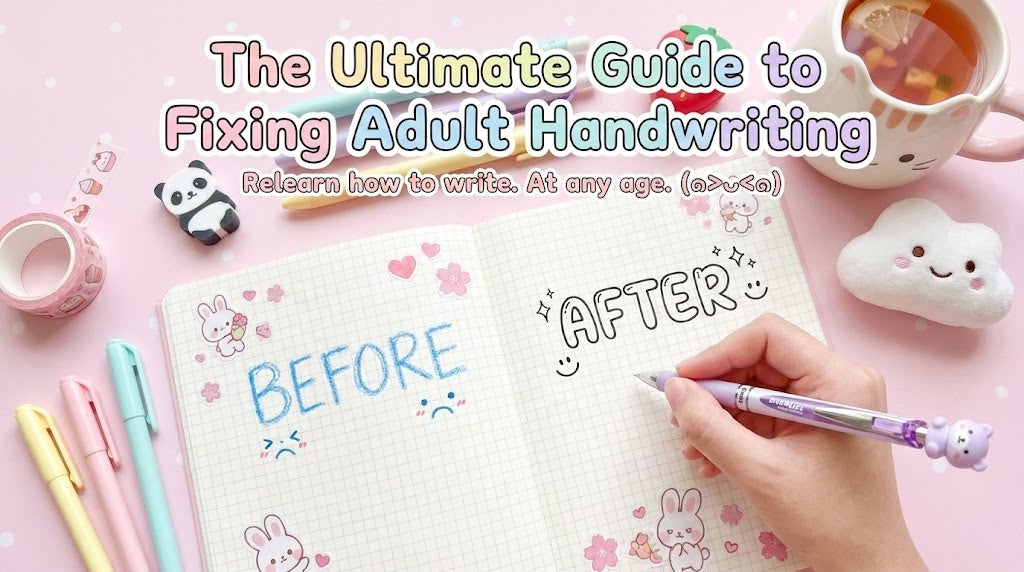
We need to talk about the shame. You know the moment I'm talking about.
You are in a high-stakes meeting, standing in front of a whiteboard. You have a brilliant idea to share. You uncap the marker, start writing, and suddenly, the room goes quiet. Your "innovation" looks like "innuvutiun." Your sentences slide downhill like a sinking ship. You try to joke, "Haha, sorry, I should have been a doctor with this handwriting," but deep down, it stings. It feels unprofessional. It feels childish.
I've spent years rebuilding my own handwriting as an adult—first out of necessity, then out of obsession. I write every day, test different pens, paper types, grips, and training methods, and document what actually works. This guide comes from real frustration, sore hands, failed attempts, and finally, consistent results.

Here is the truth that most people don't want to admit: You were not born with bad handwriting.
Handwriting is not a genetic trait like blue eyes or curly hair. It is strictly a function of Fine Motor Skills and Muscle Memory. The reason your handwriting is "ugly" is simply because you have practiced the wrong muscle movements for 20 years. You have reinforced a bad habit thousands of times.
The good news? Because of Neuroplasticity—your brain's ability to reorganize itself by forming new neural connections—you can rewrite that muscle memory at any age. It doesn't matter if you are 25 or 65. I've spent years rebuilding my own handwriting as an adult—first out of necessity, then out of obsession. I write every day, test different pens, paper types, grips, and training methods, and document what actually works.
In this deep-dive guide, we are going to break down the biomechanics of writing, throw away your damaging tools, and put you on a 4-week training regimen that actually works. This guide comes from real frustration, sore hands, failed attempts, and finally, consistent results.
Part 1: The Biomechanics of Ugly Writing

Before we fix the problem, we must diagnose the injury. Why, exactly, does your handwriting look the way it does? Most adults suffer from two specific physical syndromes.
⚠️ Syndrome 1: The "Death Grip" (White Knuckles)
Look at your hand right now as you pretend to hold a pen. Are your knuckles turning white? Is your index finger hooked aggressively over the thumb, forming a tight fist? Are you pressing down so hard that you leave dents in the paper underneath?
The Consequence: When you squeeze the pen, you engage the large flexor muscles in your forearm. These muscles are designed for gripping (like holding a hammer), not for precision. This tension locks your wrist, causing shaky lines, hand cramping after 2 minutes, and rigid, jagged letters.
⚠️ Syndrome 2: The "Finger Writer"
Place your hand on the desk. Write the word "Hello." Did your wrist slide across the table? Or did your wrist stay glued to one spot (the anchor) while your fingers did a little dance to draw the letters?
The Consequence: Most adults are "Finger Writers." This limits your range of motion. You can only write 3-4 letters before you reach the limit of your finger extension, and then you have to pick up your hand and move it. This "stop-start" motion causes inconsistent spacing and makes your writing look disjointed.
Handwriting specialists and occupational therapists frequently identify grip tension and limited arm movement as the most common causes of poor adult handwriting. These patterns are widely discussed in fine motor skill rehabilitation and handwriting re-education practices.
Part 2: The "How-To" (Correcting Your Mechanics)

This is the part most tutorials skip. They tell you to "practice," but practicing with bad form just makes bad habits permanent. We need to reboot your operating system.
Step 1: The Paper Tilt Geometry
If your paper is straight in front of you (90 degrees parallel to the table edge), you are setting yourself up for failure. Your arm naturally moves in an arc, not a straight line.
- For Righties: Rotate the paper 45 degrees counter-clockwise. The top right corner should point towards 12 o'clock. This allows your arm to move in a natural sweep across the page without twisting your wrist.
- For Lefties: Rotate the paper 45 degrees clockwise. This allows you to write "under" the line. This is the single most effective way to solve the dreaded "Smudge Hand" problem without buying special ink.
Step 2: The "Arm Movement" (The Palmer Method)
In the early 1900s, A.N. Palmer revolutionized American handwriting. His secret? Stop using your fingers. The goal is to lock your fingers and wrist in a mostly static position, and drive the movement entirely from your shoulder and elbow.
Stand up. Pretend to write your name on a giant invisible chalkboard in the air. Notice how your shoulder rotates? Notice how your elbow drives the motion? Your fingers are just holding the chalk; they aren't doing the work.
Now, sit down and try to replicate that feeling on paper. It will feel weird and floaty at first. Your handwriting might even look worse for the first day. That is normal. You are training a new muscle group (Gross Motor Skills) to do a job usually done by Fine Motor Skills.
During the first few days, most people see their handwriting get worse, not better. This is expected. You are shifting control from fine motor habits to larger muscle groups, and temporary instability is part of the retraining process.
Part 3: Environmental Mechanics (The "3 Nines" Rule)

Handwriting is not just about your hand. It is about your entire skeletal alignment. If you are hunched over like a shrimp, your shoulder blade (scapula) is locked, preventing the "Arm Movement" we just learned.
- Eyes: One foot (30cm) from the paper. Do not bury your nose in the notebook.
- Chest: One fist width from the desk edge. Leaning into the desk restricts breathing and movement.
- Fingers: One inch (2.5cm) from the pen tip. Gripping too close to the tip (choking the pen) blocks your view of what you are writing. (Not sure if your grip is right? Check our step-by-step guide on How to Hold a Pen Properly).
Pro Tip: Ensure your desk height allows your elbow to rest at a 90-degree angle. If your elbow is too low, you will naturally "hunch" your shoulders, leading to neck strain and shaky lines.
Part 4: The Hardware Upgrade (The Viscosity Science)

You cannot fix your handwriting with a $0.50 Bic ballpoint pen. It is physically impossible. Here is the science of why.
The Villain: Oil-Based Viscosity
Standard ballpoint pens use a thick, oil-based paste. To get this paste to transfer onto paper, you must apply significant downward pressure. This pressure triggers the "Death Grip" reflex. You have to squeeze to write.
The Hero: Water-Based Gel & Liquid Ink
Gel ink (like in the Pentel EnerGel) and Liquid ink (like in Fountain Pens) have low viscosity. They flow onto the paper the moment the nib touches the surface. You require zero downward pressure. This allows your hand to relax, which instantly reduces tremors and improves flow.
The "Gateway Drug" to good handwriting. The needle tip offers precision visibility, and the ink dries instantly (great for lefties).
If you are used to heavy resistance or write extremely slowly, gel ink may feel slippery at first. This adjustment period is normal and usually resolves within a few practice sessions.
The "Rehab Tool." If you have hand pain, this is non-negotiable. Its center-of-gravity balance and dual-layer silicone grip force your fingers to relax.
If you prefer very lightweight pens or have extremely small hands, the Dr. Grip's larger diameter might feel unfamiliar initially. However, its ergonomic design promotes proper grip alignment.
Lined paper is useless for training. Grid paper provides a vertical axis to correct your slant and letter width. It is your scaffolding.
If you are accustomed to blank or wide-ruled paper, the grid pattern may feel restrictive at first. This constraint is intentional to build spatial awareness and consistency.
📄 Advanced Paper Science: Why 80gsm Matters

You bought a nice pen, but your writing still looks fuzzy? The culprit is the paper.
- Feathering (Spiderwebbing): When ink spreads into the paper fibers like tiny roots. This makes crisp lines look blurry. Solution: Use coated Japanese paper (like Kokuyo or Maruman).
- Ghosting: When you can see what you wrote on the other side of the page. This is distracting.
- The GSM Rule: Standard copy paper is 70gsm (Grams per Square Meter). For practicing handwriting, we recommend 80gsm to 100gsm. The added thickness provides a subtle "cushion" (damping) that improves control and prevents bleed-through.
Part 5: The Practice Protocol (Letter Families)

Do not practice A, B, C, D. That is inefficient. The alphabet is constructed from 4 Core Shapes. We practice by "Shape Families."
Family 1: The Anti-Clockwise Ovals
The Move: Imagine a clock face. Start at 2 o'clock, curve up to 12, down to 6, and back up to 2.
The Goal: Master the letter "o". If you can draw a perfect oval, you have automatically mastered 6 different letters. They are all just an "o" with different sticks attached.
Family 2: The Lines & Humps
The Move: Start at the top, drop straight down. Bounce back up the same line to create the arch.
The Trap: Do not separate the downstroke and the upstroke. They must overlap perfectly until the arch branches off.
Family 3: The Ascenders (Loopers)
The Move: These are tall letters. Use the full height of your grid box. The key is that the "stick" must be parallel to your other vertical lines. If your 'l' tilts right and your 'h' tilts left, your writing looks messy.
Family 4: The Descenders (Danglers)
The Move: These go into the basement. The loop at the bottom should be the same width as the loop at the top. Consistency is key.
Part 6: Find Your "Font Personality"

Before we start the 30-day schedule, you need a goal. "Good handwriting" comes in many flavors. Pick one style to practice.
The Architect
Vibe: Engineering, Precision, All-Caps.
Technique: Letters are squares. No curves, only angles. Lift the pen after every single stroke.
The Minimalist
Vibe: Clean, Modern, Instagram-ready.
Technique: Small x-height, round loops, lots of whitespace between letters.
The CEO Cursive
Vibe: Fast, Efficient, Executive.
Technique: Focus on forward momentum. Letters are barely formed; the "flow" matters more than legibility.
Part 7: The 30-Day "Rehab" Schedule

This 30-day schedule is designed to restore control and consistency, not to produce decorative calligraphy. Real handwriting improvement happens through repetition, not shortcuts.
You can't fix 20 years of bad habits in 20 minutes. You need a regimen. Here is your Auntie Mei Prescription. Commit to 15 minutes a day. No more, no less.
| Week | Focus | The Drill |
|---|---|---|
| Week 1 | Mechanics & Shapes | Do not write letters. Draw continuous loops (coils) and vertical lines (fences) using your shoulder. Focus on keeping your wrist off the table. If your lines are shaky, you are moving too slow. Speed up slightly to smooth out the jitter. |
| Week 2 | Lower Case Families | Practice the families above. One family per day. Focus on Consistency. Every "a" must look identical to the previous "a". Use the grid lines to check your height. |
| Week 3 | Spacing & Pangrams | Write "The quick brown fox jumps over the lazy dog." Focus on spacing. The space between letters should be tight, but the space between words should be exactly the width of the letter "o". This "visual rhythm" makes even messy writing look legible. |
| Week 4 | Speed & Flow | Now, increase your speed slightly. Try copying a paragraph from a book. If your form collapses, slow down again. This is where you develop your personal "style." |
Part 8: Busting Common Myths

Truth: Writing too slowly actually causes more wobbles because your fine motor muscles get fatigued holding the pen steady. You need Rhythm, not slowness. Write at the speed of a steady heartbeat.
❌ Myth 2: "Tracing is cheating."
Truth: Tracing is the fastest way to learn. It is not about copying the visual; it is about teaching your muscles the feeling of the curve. Use tracing paper (vellum) over your favorite font to build the "road map" in your brain.
Part 9: The Psychology of Handwriting (Why Bother?)

In an age of AI and instant messaging, why spend a month fixing your handwriting?
Because it is the ultimate Digital Detox. Handwriting forces you to slow down. You cannot copy-paste. You cannot delete. It is a mindful practice, like meditation. When you focus entirely on the curve of a "g" or the cross of a "t", your anxiety about emails and deadlines fades away.
Your handwriting is your voice on paper. It doesn't need to be perfect copperplate script, but it should be clear, confident, and uniquely yours.
Part 10: Frequently Asked Questions (FAQ)
1. Should I learn Cursive or Print?
As an adult, start with Print (Block Letters). It is more practical for daily life and easier to control structurally. Once you master the spacing and slant of print, you can graduate to Cursive for speed.
2. My hand hurts after 5 minutes. What's wrong?
You have the "Death Grip." Your power is coming from squeezing your fingers, not your shoulder. Switch to a wide-body ergonomic pen like the Pilot Dr. Grip or Uni Alpha Gel immediately to force your hand to relax.
3. Does tracing (using copybooks) actually help?
Yes. Tracing is not cheating; it is training wheels for your brain. We recommend using Translucent Vellum Sticky Notes to place over a font you like and trace it. This builds the spatial map in your brain without wasting paper.
4. Can I fix my handwriting on an iPad?
It is much harder. The glass screen is slippery and offers zero friction feedback. If you must use an iPad, you absolutely need a "Paper-like" matte screen protector to simulate the resistance of real paper. Without friction, your muscles cannot learn control.
5. I am left-handed. Any specific tips?
Lefties struggle with smudging. 1. Use Quick-Drying Ink (like Pentel EnerGel or Zebra Sarasa Dry). 2. Rotate your paper 45 degrees clockwise. This allows you to write "under" the line so your hand doesn't drag through the ink.
6. Why does my handwriting get worse when I write fast?
When speed exceeds muscle memory, structure collapses. This is normal. Practice "Rhythmic Writing"—writing to a steady beat (like a metronome) rather than rushing. Slow down to speed up.
7. What is the "Golden Rule" of spacing?
The space between your letters should be tight, but the space between your words should be the width of a lowercase "o". This visual rhythm makes even messy handwriting look legible.
8. How long does it take to see noticeable handwriting improvement?
Most adults notice better control and spacing within two to three weeks of consistent practice. Visual neatness usually improves after muscle tension is reduced.
A final note from Auntie Mei
Handwriting is a physical skill, not a talent. Tools that reduce pressure and friction allow your muscles to relearn movement patterns naturally. Comfort comes first. Neatness follows.
Shop The Handwriting Rehab Kit


